** Background **
Omron approached us for creating a brand new website for the european region. We worked closely with the team there to create a modern and easy to use website for their clients.
** Discovery **
The project started with an extensive research period where we interviewed people from multiple European countries to learn about cultural differences and norms.
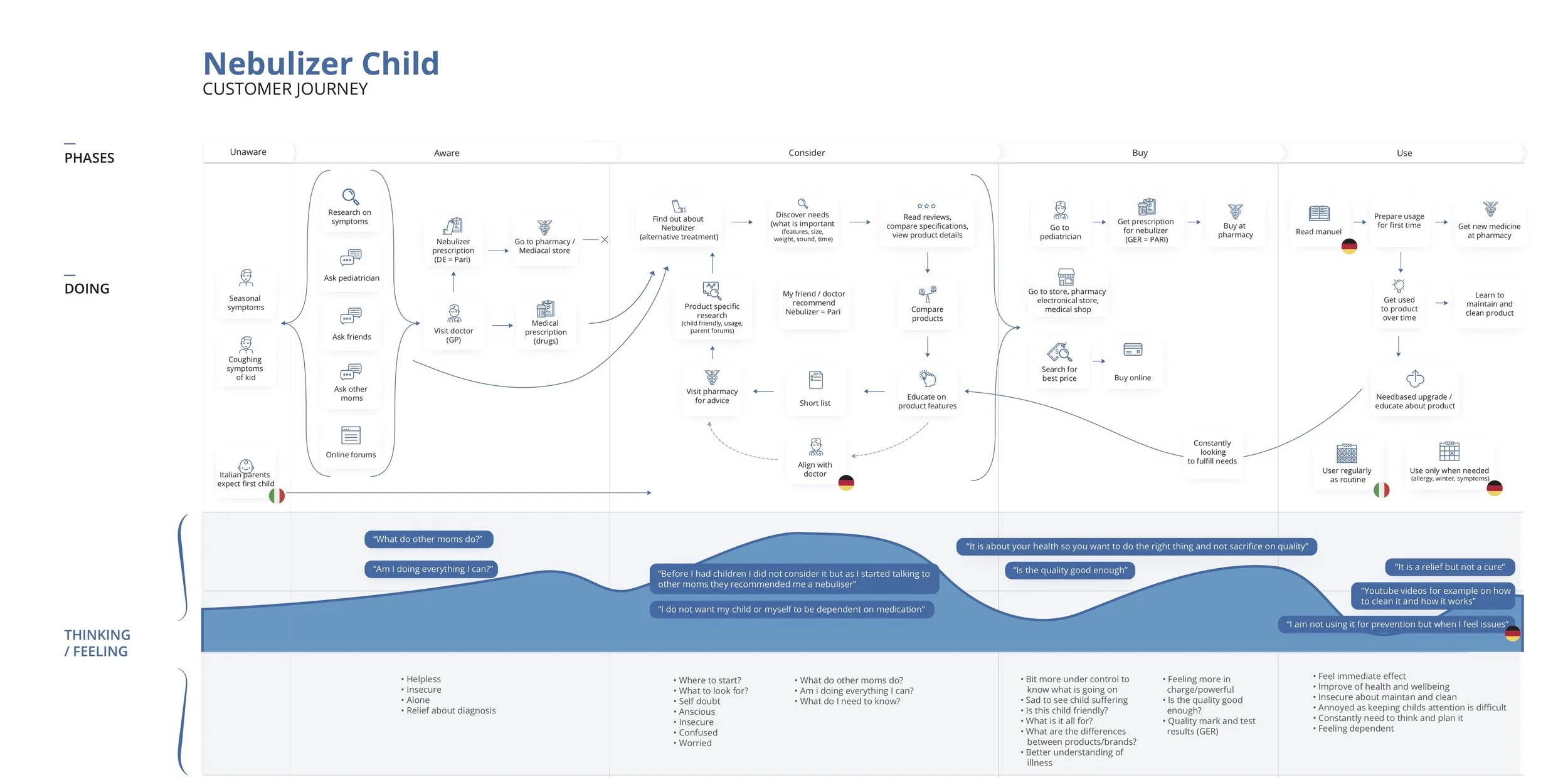
Nebulisers (a medical device for treating respiratory illnesses) was frequently bought by people in Italy for the treatment of colds.
However, in the UK nebulisers were unheard of and basically only Asthma patients used it.
Brand recognitions was low amongst customers but hight amongst doctors a medical professionals.
The rise of fitness tracking and cheap Chinese brands was a significant threat.
The customer journey was mapped for the biggest product categories to identify potential entry points and emotional aspects:
** Design Sprint **
We ran a week long design sprint with the client based on the Google design sprint methodology — to find opportunities and create a testable prototype. During the sprint we also wanted to give a glimpse into our way of working. This makes it easier later on to work with the client and gives us a good starting point.
** Creating a Prototype **
We created a clickable prototype in InVision based on the sketches from the workshop. At the time Omron was selling 10 types of blood pressure monitors with very little differentiation. We wanted to help people understand the differences between each product and find the right device. To help Omron position itself as a guide in the healthcare space we came up with a new tone of voice and content section.
Wireframes from the design sprint
** Testing **
To test the prototype we invited 6 people for an in-house usability test and interview. In the first 20 minutes of the sessions we asked about medical devices they might own, health tracking and their thought on different healthcare brands.
General Findings and Feelings:
Important to see how a product is used
Not very clear what OMRON is -a brand, product?
“I’m not looking for solution but help to identify my problem”
Facts and figures were not liked by everyone - need social proof
Positive about reviews, prefer to see them at the bottom of the page
Want to choose what information to see in more details and what not (especially on mobile)
Critical Findings:
Importance of actionable and personalised advice rather than generic (not credible if at the beginning “I already knew that of course” facts are stated)
Communicating the added value of the product (preferably why this is the right choice for the customer) is important
Highlighting differences between devices is important from the start


